A question we often want to ask of single-molecule data is whether the data fall into one or more clusters. For example, perhaps we have a single-molecule FRET system in which each molecule we observe explores either two or three states. We might want to ask whether all of the molecules in a population explore the same three states, or if the molecules that explore only two states share either state with the three-state population. Perhaps the population-averaged FRET values of the different states, if they do form clusters, tells us something interesting about our system.
Here we compare three different ways of plotting the data to get a sense for how the data cluster: histograms, kernel density estimation (KDE) plots, and cumulative distribution functions (CDFs). Histograms are the most commonly used tool for this purpose, because they are the most intuitive, but they are the least quantitative. CDFs offer the best tool, especially for comparisons between data sets.
The code in this tutorial can be found in this gist.
Generate data
We start with a synthetic data set drawn from three Gaussians,
parameterized by means mu(i) and standard deviations sigma(i),
mu    = [0.45 0.75 0.60];
sigma = [0.02 0.03 0.02];
We will generate a dataset consisting of 100 samples drawn from the first Gaussian, 200 samples from the second Gaussian, and 50 samples from the third:
n_samples = [100, 200, 50];
D = @(i) normrnd(mu(i), sigma(i), 1, n_samples(i));
data = [D(1), D(2), D(3)];
Compare histograms, KDEs, and CDFs
Given a new dataset, how would you start to explore it? For a 1D-valued
dataset like this one, a common first step would be to make a histogram. If we
call Matlab’s hist function with default parameters, we might be able to
guess that there are three Gaussian clusters in the data, though you could also
guess there are just two.
figure
hist(data);  % default number and placement of bins
xlabel('Value of data');
ylabel('Counts');
set(gca,'Fontsize', 14);
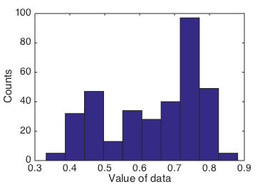
Histogram of data using default parameters.
What if we had chosen a different set of bins, say, bins 0.075 apart, starting at 0 and ending at 1?
This time, we will also normalize the histogram, so that its values sum to 1. To normalize, we divide by the total number of counts and change the y-axis label to frequency:
figure
[n, xout] = hist(data, 0:0.075:1);
bar(xout, n ./ sum(n));
xlabel('Value of data');
ylabel('Frequency');
set(gca, 'Fontsize', 14);
xlim([0 1]);
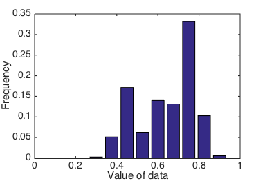
Histogram of data, using custom bin widths and positions.
Consider if data were a data set you had collected experimentally, and
you didn’t know how many clusters or populations to expect. How would you
know whether 10 equally spaced bins or bins at 0:0.075:1 was giving you the
“right” answer? If you had a second data set, collected under a different
condition (say, looking at activity of a mutant version of your protein
of interest), how would you know what bins to choose to best compare
them?
If you play around with the parameters of the parameters of the three Gaussians
and the bin widths and locations, you can get a sense for how much visual
variation there can be.
The parameters used to construct the histogram can have a significant impact on
its visual impression, and the default of hist to use 10 equally-spaced bins
is not always the best for identifying structure in any given dataset.
In fact, the use of hist is now discouraged in favor of
histogram,
in part for this reason.
The new-and-improved histogram
function has a
data-dependent automatic binning heuristic (see e.g. the Bayesian Blocks
algorithm
for a related idea). It works rather well, as shown in Figure 3:
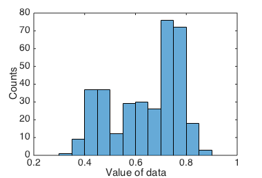
Histogram of data, using Matlab's histogram() function.
histogram still suffers from the potential for binning artifacts.
KDEs
An alternative to histograms is a kernel density estimate (KDE) plot. The idea of a KDE plot is: at every data point, plot a little Gaussian density, and then sum all the Gaussian densities together. (This kind of KDE has a Gaussian kernel, but there are other choices of kernel as well.)
The only parameter to vary, then, is the standard deviation parameter of the individual Gaussian densities, which is called the bandwidth.
Let’s start with a bandwidth of 0.05:
[f1,k1] = ksdensity(data,'bandwidth',0.05);
figure
plot(x1,f1,'-b','Linewidth',2)
xlabel('Value of data')
ylabel('Density')
set(gca,'Fontsize',14)
Figure 2 shows the resulting KDE. The shape of the KDE should be reminiscent of the histograms in the previous section; they display the data in a conceptually similar way.
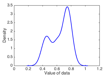
Kernel density estimate with bandwidth 0.05.
What happens if we try a range of different bandwidths?
bandwidths = [0.05, 0.1, 0.01, 0.001];

figure
xlabel('Value of data');
ylabel('Density')
set(gca, 'Fontsize', 14);
hold on
for bandwidth = bandwidths
    [f, x] = ksdensity(data, 'bandwidth', bandwidth);
    h = plot(x, f, '-', 'Linewidth', 2);
    legend(h, sprintf('bw = %0.2f', bandwidth));
end
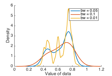
Kernel density estimates with various bandwidths.
A good way of determining how robustly you can separate different clusters of data is to vary the bandwidth, and see which peaks appear and disappear.
KDEs avoid the bin size and location details of histograms, since they have only one bandwidth parameter to adjust, and can give a more consistent visual impression. Moreover, the visual impression can’t change significantly due to small changes in the bandwidth. But your interpretation of the data is still subject to a choice of smoothing parameter, and it would be better to have a parameter-free visualization method.
CDFs
A cumulative distribution function (CDF) measures the integral under a PDF (probability density function) from $-\infty$ up to a particular value. The PDF is the expression we most immediately associate with common distributions; for example, the Gaussian distribution has a PDF of $$ f(x) = \frac{1}{\sqrt{2 \pi \sigma^2}} \exp \left(- \frac{(x-\mu)^2}{2 \sigma^2} \right), $$ and so its CDF is defined as $$ F(x) = \int_{-\infty}^x f(t) \, \mathrm{d}t. $$ The way to think about the information in a CDF is that for a value $x$, $F(x)$ tells you how frequent a value smaller than $x$ is.
CDFs have no smoothing or binning parameters to vary, and therefore provide a
good way to visualize new data or compare different datasets.
Given a data sample, we can construct an empirical CDF by averaging step
functions,
$$ \widehat F(x) = \frac{1}{N} \sum_{i=1}^N I[x_i < x], \qquad I[a < b] = \begin{cases} 1 & a < b \\\ 0 & \text{otherwise} \end{cases}. $$
We can compute an empirical CDF in Matlab by using the ecdf function:
[c, xc] = ecdf(data);  % computes an empirical CDF
figure
plot(xc, c, 'Linewidth', 2);
xlabel('Value of data');
ylabel('Cumulative probability');
set(gca, 'Fontsize', 14);
ylim([0 1]);
xlim([0 1]);
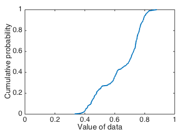
Cumulative probability of data.
Figure 5 might look a bit unfamiliar, but a CDF shows us the same information as a KDE or histogram, without the bias that might come from poorly-chosen parameters.
To gain a more intuitive understanding of what the CDF represents, we can plot one on the same set of axes as a KDE:
figure
ax = plotyy(x3, f3, xc, c);
xlabel('Value of data');
ylabel(ax(2), 'Cumulative probability');
set(ax(2), 'Fontsize', 14);
ylabel(ax(1), 'Density');
set(ax(1), 'Fontsize', 14);
ylim(ax(1), [0 8]);
xlim(ax(1), [0 1]);
xlim(ax(2), [0 1]);
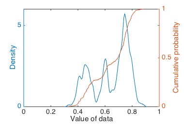
Cumulative probability of data compared to a KDE.
Peaks in the KDE correspond to steep slopes in the CDF. That is, clusters in the data appear as steep slopes, where counts are accumulating quickly in the CDF at a certain $x$ value.
Visualizing both a CDF and a KDE (or a few KDEs with different bandwidth settings) on the same axes can give us multiple views on the same data, and let us check that our interpretations are consistent across several views rather than being artifacts of some particular parameter choices. From this plot we might feel confident concluding that there are at least two clusters in the data, and likely a third, less populated, cluster in between the two main clusters.
Data cluster assignment
We conclude with some remarks on a related problem to the identification of clusters in a data set, which is the assignment of each data point to a particular cluster. This can be a difficult task, especially when data clusters overlap (more than in the sample data here). Often the solution in the single-molecule field is to assign data to clusters based on a threshold value (which is usually determined from a histogram). For example, based on the first histogram we made, we might say that anything with a value greater than 0.7 is in one cluster, and anything with value less than 0.7 is in a second. This works well for clusters that are well-separated, and has the advantage of being relatively quick and easy. But for less well-separated data, an alternative is to fit a mixture of PDFs that we think describe the data well (so in our example here, a mixture of three Gaussians), and then for each data point compute the density value that each mixture component assigns to it. Then we could assign each data point to the cluster which assigns highest density to that data point. An example is given at the end of the gist.
Thanks to Matt Johnson for teaching me this material, and for editing this tutorial for accuracy and clarity!